Sports is full of spacial data. Data visualizers love this. Take the points and plot them by x and y location. Instantly the data is in a format that we can relate to and gain insight from. Too many data points? Aggregate and count points by region to create a head map or something similar. Want to compare two sets of points? Put two charts side-by-side. All of this is done with NBA shot position, but it has its shortcomings.
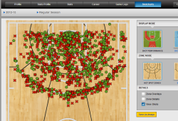
At stats.nba.com you can see shot charts like this:
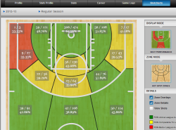
At hotshotcharts.com you can see shot charts heated by success rate:
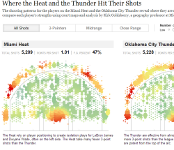
Even at the much (rightly) worshiped New York Times they're doing charts like this:
Shotcomings
I would say that the number one shortcoming of these charts is the difficultly in comparing two sets of points. Take the New York Times piece for example. Try to compare the Heat to the Thunder or the various pairs of players side-by-side. Your eyes will flick back and forth and maybe you'll find a difference, but it's hard and you can't help but feel that you are missing something.
Why? Too much data. The points are not together for easy comparison.
Solution
What I am experimenting with is greater use of aggregation in these circumstances. What if we take average positions to aggregate thousands of data points and then plot those averages together to gain insights?
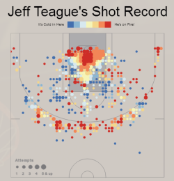
Here is my first piece on basketball:
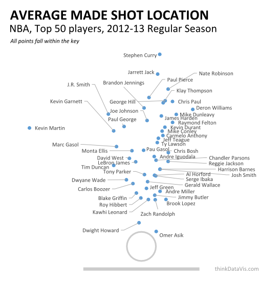
Unfortunately the concept of average location is a bit abstract, and thus that creates a greater overhead of effort for the viewer to overcome before they start getting value out of the graphic. However, after that we can start to compare players in a way that we never have before. See the first post here.