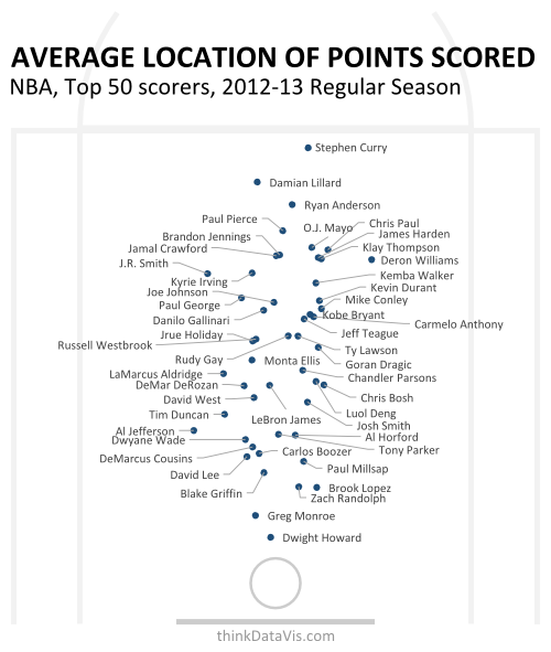
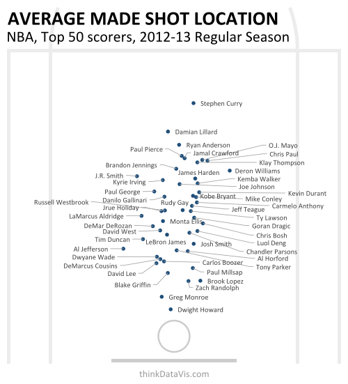
Here are two updated charts following up from my previous post.


What's new?
-
The players included are no longer someone else' list of 50 notable players, but rather the 50 players who scored the most points in the 2012-13 regular season
-
More of the courts lines have been included to provide greater context to the data
-
The first chart shows the average position that points are scored from. This is a weighted average that puts more emphasis on 3 pointers and further demonstrates how exceptional Stephen Curry is, as the guys at deadspin have noted
-
The second chart shows the average position of made shots as per the original
Collaboration
Collaboration is an important thing. Earlier with my weak knowledge of basketball I published what I thought would be an interesting visual here. Seems I was correct. But with a little conversation with the guys at deadspin.com, some very easy improvements could be made.