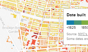
I saw this recently here. It's a map showing the age of Brooklyn's buildings.
What do I get from the map?
Every data point is plotted, so if I were a Brooklyner, I would probably find my street or look up my favourite building. For some people this seems to have reduced confidence in the data quality. Having only ever been half-way across the Brooklyn Bridge, instead I looked at the map to try and find interesting trends. Some are certainly visible, but I found myself wanting a map with some aggregation.
What I tried.
So I made this. Yes, a post will follow on how.
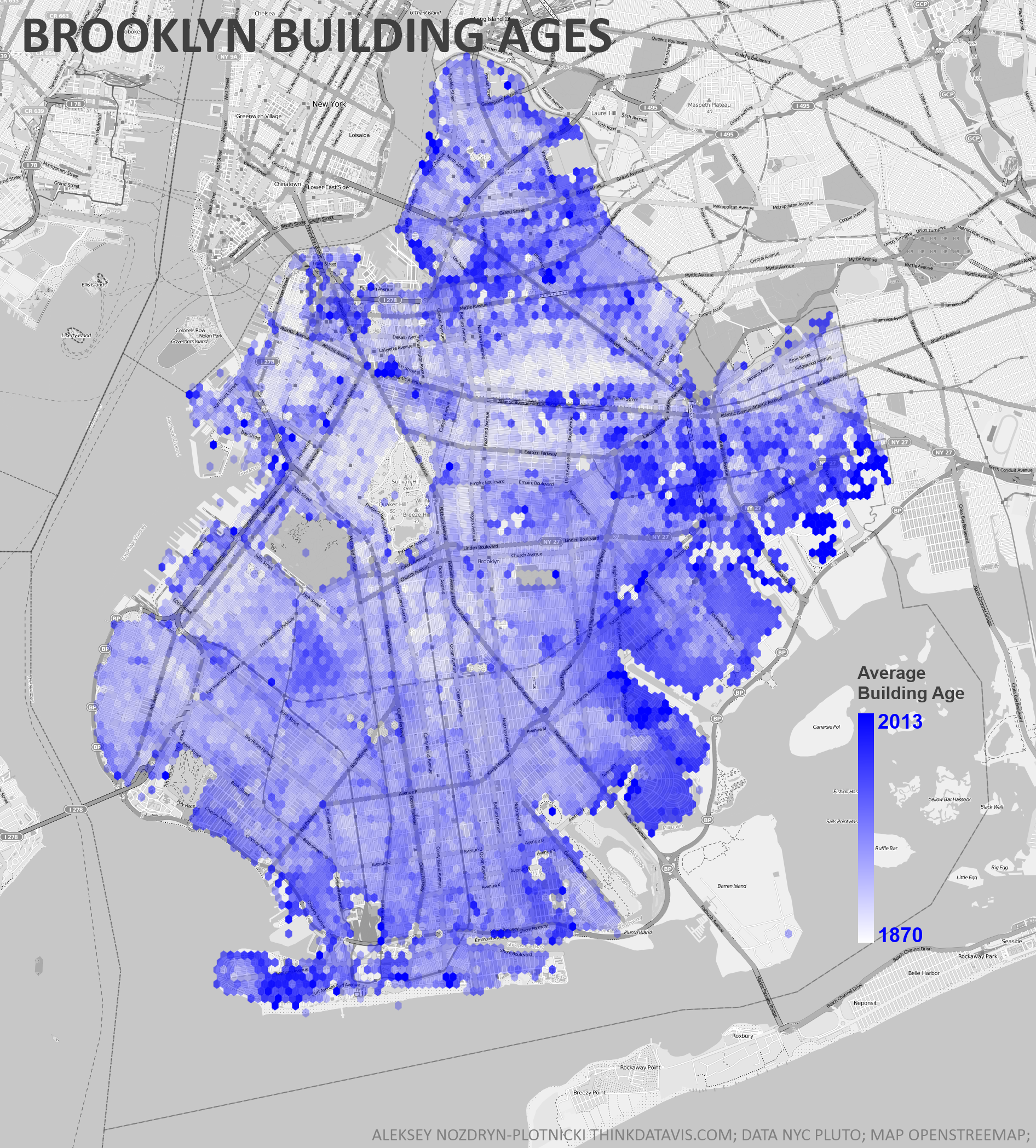
(click for the huge version)
By showing the average build year for buildings in each hexagon, rather than plotting every single data point, some patterns are more visible. Though I will admit that once you've seen them in the above map, they are often quite visible in the original.
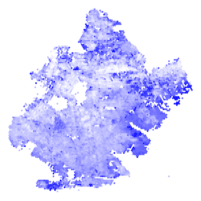
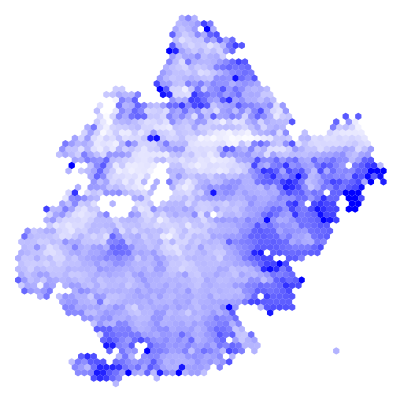
Hexagon Size
The size or "radius" of the hexagons is an important parameter of the visualization. As you can see clearly below, our ability to spot patterns of a certain size requires aggregation of a similar size. Compare the first with the last and you'll see.


Aggregation
While my map is not a compelling improvement on the original, I think it is a nice demonstration of the power of aggregation. Data visualizers can be overly focused on plotting the data directly. Analysts, however, know that you can rarely accomplish anything without some good aggregation. This intersection of data viz and analysis is undeniably interesting.